Friction Points
- Users find multi-card tracking confusing (42% report feeling overwhelmed).
- Lack of clear insights leads to missed budgeting opportunities (37%).
- Motivation drops without visible progress, causing early abandonment (28%).
Designed and built the product from 0→1 on my own, handling both UI and UX.
Designed and built the product from 0→1 on my own, handling both UI and UX.
Role
Product Designer
User Experience Design
User Interface Design
Team
Solo project
Timeline
Mar – Jun 2023
Tools
Figma
Miro
Illustrator
Google Forms
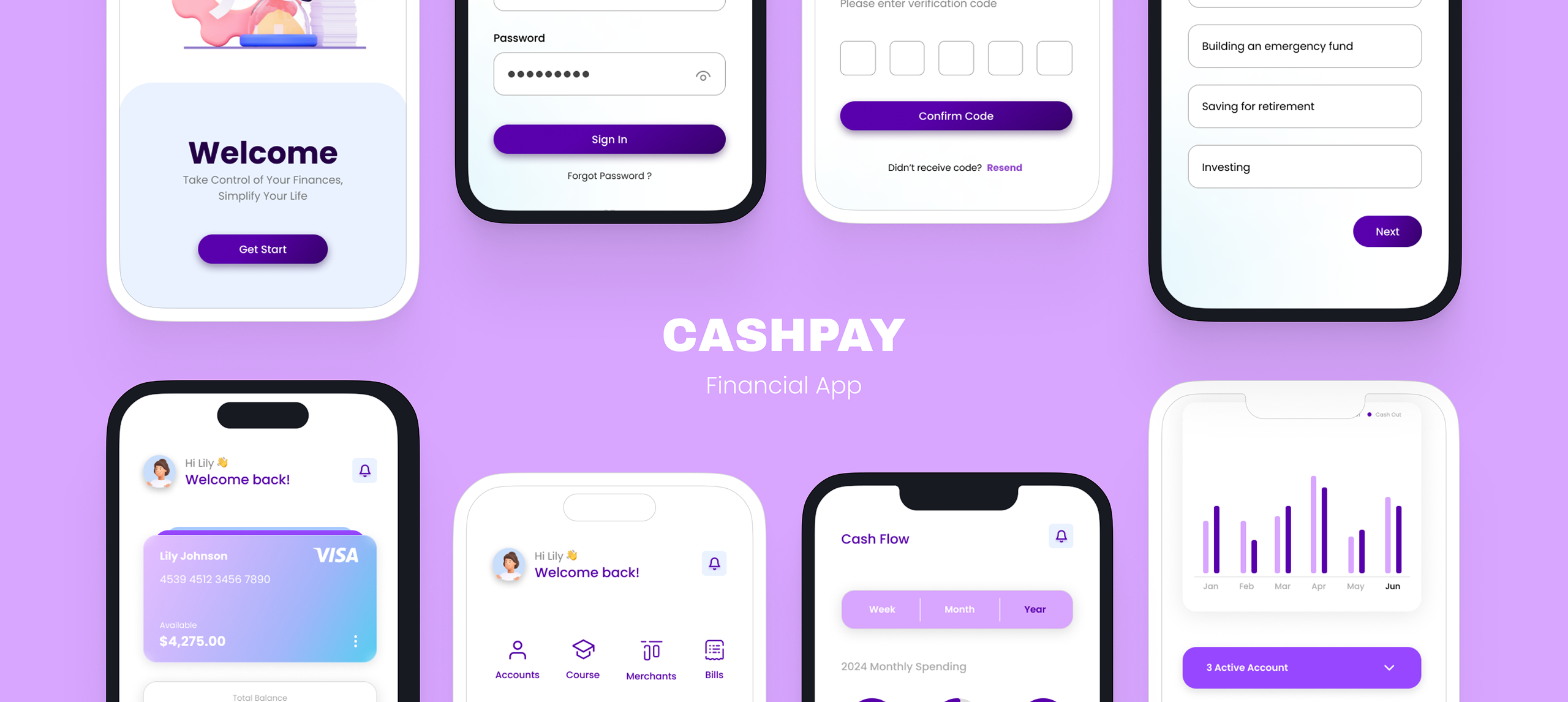
Design a financial app for users aged 18–50 that makes managing money simple, intuitive, and stress-free. The goal was to help users track multiple cards, understand their spending patterns, and stay motivated to achieve their financial goals without feeling overwhelmed by complex data or confusing interfaces.
01
Research
02
Test
03
Design
04
Analyze
05
Revise
06
Repeat
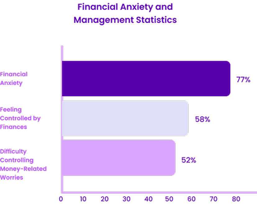
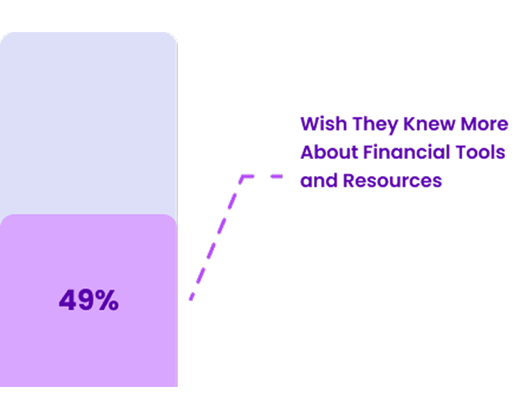
Firstly, I gathered information on how many people struggle with managing their finances. Below are some statistics I collected to create this chart:
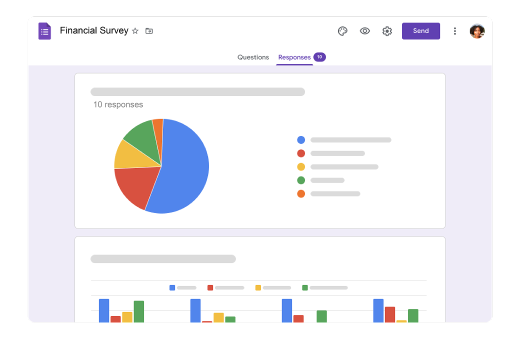
I conducted a survey with 10 participants to understand their approaches to managing their finances.

College Student / Hamilton, On
Background
Emily, 20, a sophomore studying journalism, balances part-time work and some parental support while living in a shared apartment and learning to manage her finances independently.
Goals
Pain Points
Needs & Motivations
“I need simple, clear tools to manage my money, track my budgets, and savings.”
“I want financial independence, practical money skills, and freedom to explore career and travel.”

Software Engineer / Toronto, On
Background
David, 30, is a software engineer at a tech startup who lives downtown, enjoys a busy social life, and earns a good salary but struggles to balance spending and savings with his financial goals.
Goals
Pain Points
Needs & Motivations
“I want a clear overview of my finances, with automated savings and smart budgeting.”
“I’m working toward financial security, owning a home, and growing my wealth.”
Account fragmentation
High frictionInsight clarity
Medium frictionExpense tracking
High frictionI explored various financial apps to analyze their approaches and learn from their pros and cons in how they present their products.
Core Value Prop
Strategic intent
Zero-based intentional
budgeting.
Envelope-based digital
tracking.
Automated “In My
Pocket” calculation.
Basic expense
categorization.
Onboarding
User friction
Steep curve
Moderate
Fluid
Instant
Automation
Connectivity
Full Sync
Manual Focus
Aggressive
None
Positioning
Audience segment
“Pro-active Planner”
“Traditionalist”
“Visual Executive”
“Utility User”
Most financial apps either feel too basic or overly complex. Users often have to jump between accounts, manually input transactions, and make sense of cluttered data on their own turning something that should feel simple into a frustrating experience.
Scattered account management
Time-consuming manual tracking
CashPay is designed to feel effortless and intuitive, fitting naturally into everyday life. It brings everything into one clear view, automates the busy work, and helps users stay on top of their finances without feeling overwhelmed.
All-in-one financial overview
Smart, automated tracking
I created 5 tasks for users to try using the app. I sent these tasks to some users via email and received feedback from them.
Positive feedback
"Smooth operation"
"It's good design"
"The app looks great, i really like the design and the navigation of the app prototype is straight forward."
"As a new user of this app, most of the app was quick and easy to understand"
"Navigating and using the app really helped me understand"
"The cash flow pages are well designed and really address the common use cases of a financial management app"
Kyle Li
to me • 7:17 PM
Hi Nhi,
Thanks for the prototype — flows felt smooth and the hierarchy was easy to follow.
Secondary actions could be a bit clearer; happy to share more notes if useful.
Best regards,
Kyle Li
Product Design · State University
USABILITY_FEEDBACK.pdf
Kyven Chan
to me • 3:34 PM
Hi Nhi,
Finished the tasks today — navigation felt straightforward and cohesive.
Empty states could spell out the next step a bit more for first-time users.
Thanks,
Kyven Chan
Finance · Participant
USABILITY_FEEDBACK.pdf
Alan Le
to me • 7:17 PM
Hi Nhi,
Liked how cash flow summarizes weekly and monthly spend — matches how I budget.
Jumping between cards felt easy without losing context. Nice transitions.
Best,
Alan Le
Participant
USABILITY_FEEDBACK.pdf
Han Vo
to me • 3:34 PM
Hi Nhi,
As a newer user, tasks were quick to pick up; labels and icons felt consistent.
Notes from the session are attached — ping me if anything needs clarification.
Regards,
Han Vo
Participant
USABILITY_FEEDBACK.pdf
Areas for Improvement
Issue 01:
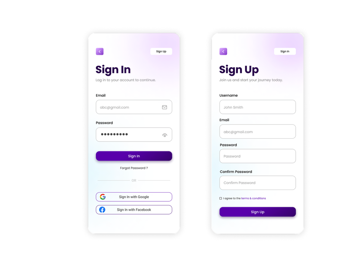
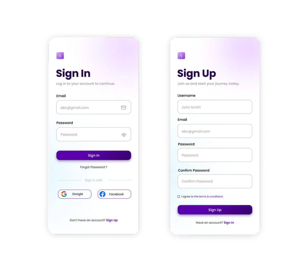
"It took a few seconds to find the sign-up because I was looking near the sign-in section, which is small."
"The password box on the sign-in page should be empty, with clear white text for the email."
Issue 02:
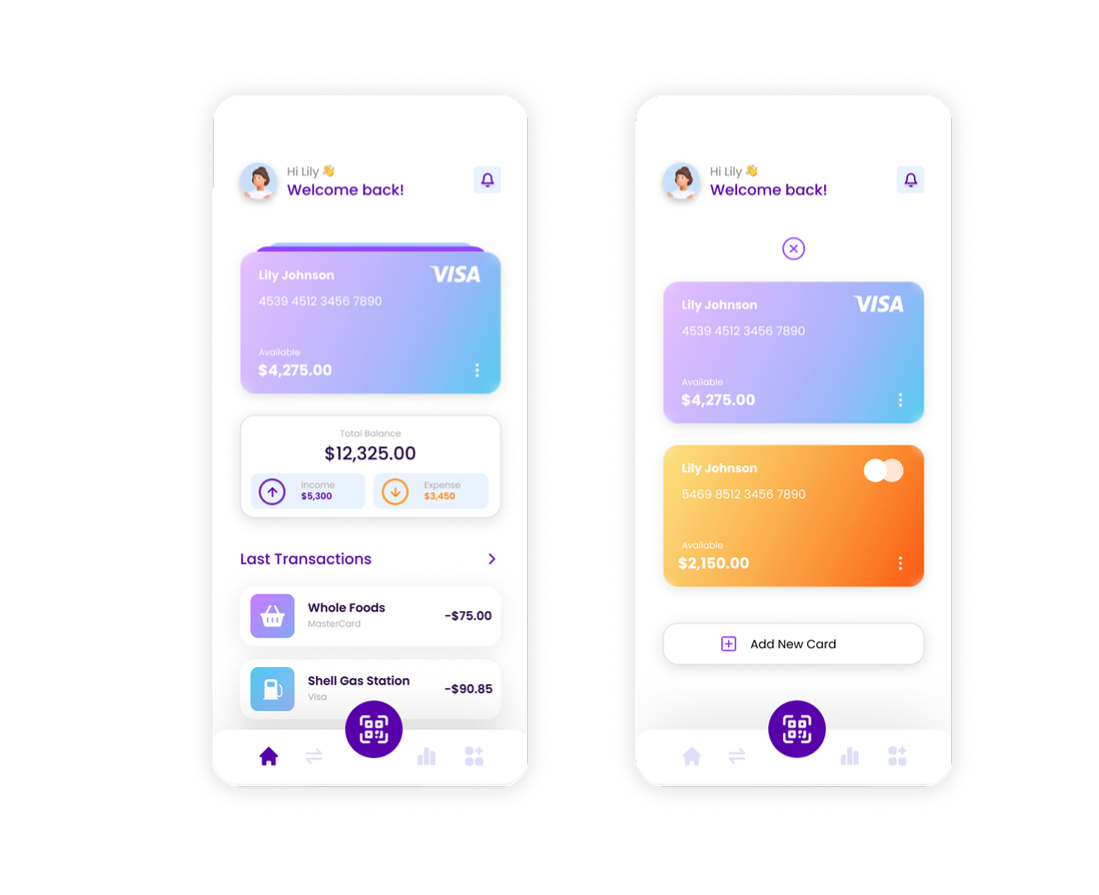
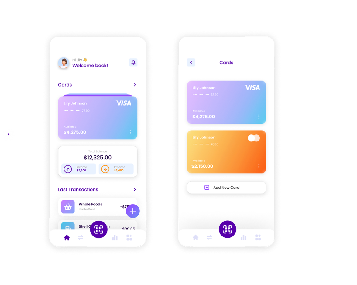
"Adding a new card was confusing. It was hard to figure out which section was for cards; a 'Card' title might help."
"When viewing all cards, it opens a new component which can be complicated."
"The cards page needs more privacy."
"Add transactions should be accessible from the homepage."
Issue 03:
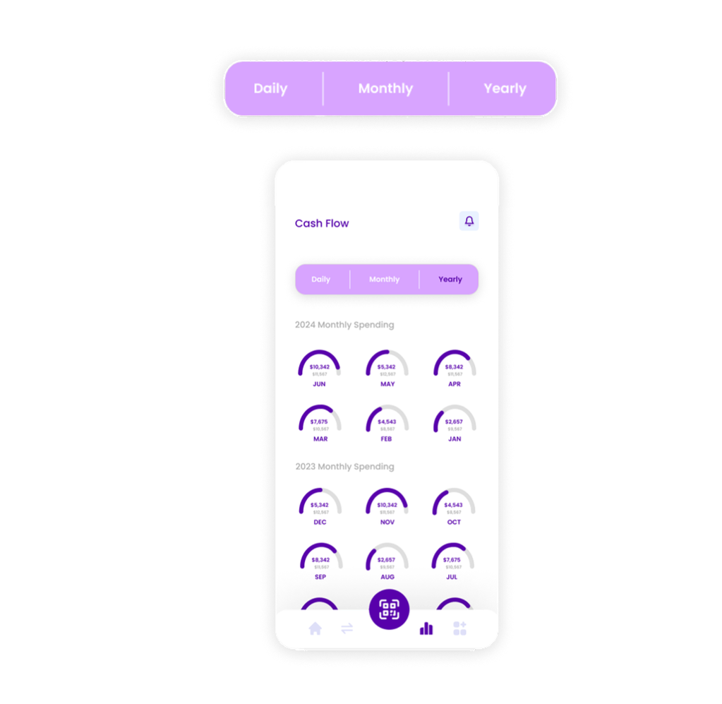
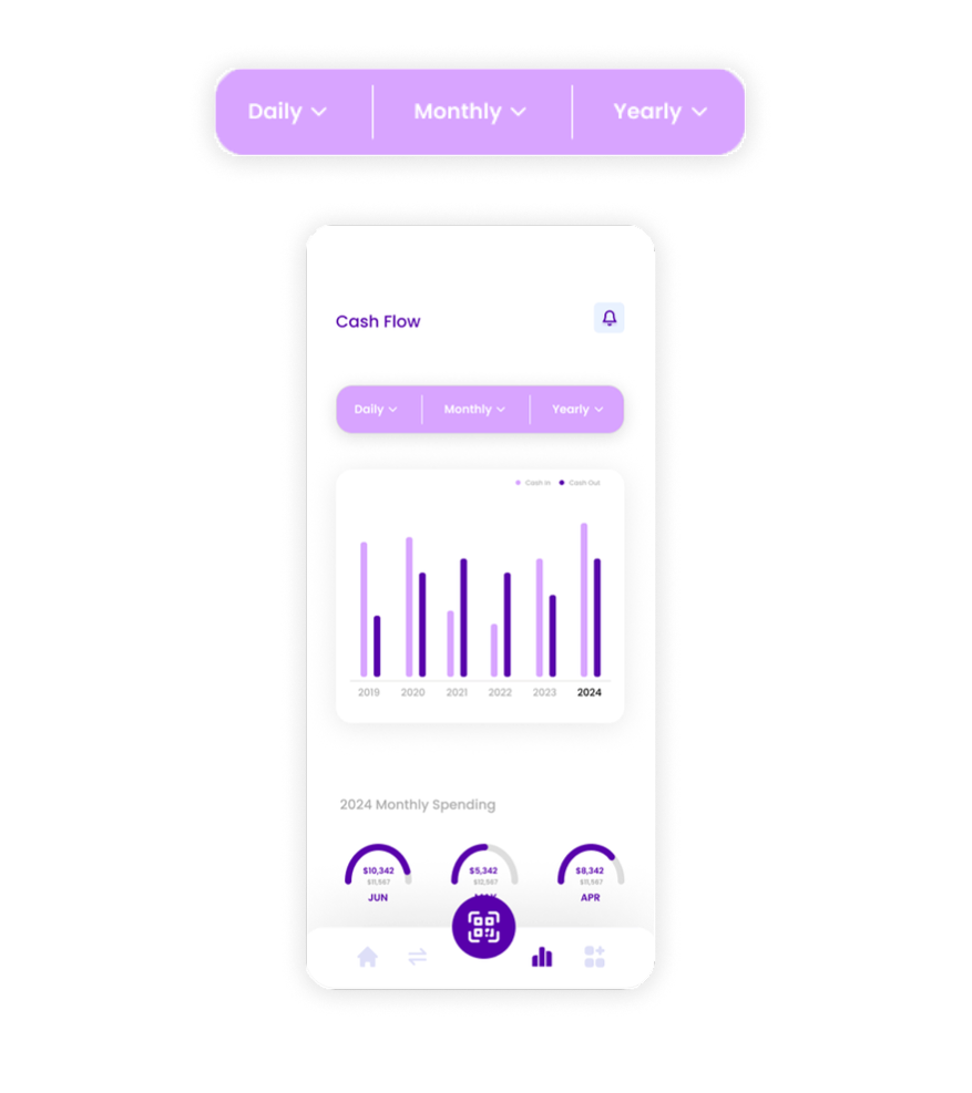
"The yearly cash flow page is hard to read "
"The yearly cash flow page should showcase only the current year with a filter to change the year."
"Include yearly totals for cash in and cash out, and add a legend."
My Key Takeaways
Different age groups use tech differently—design must bridge those gaps.
It's essential to clearly show what makes CashPay better than other finance apps.
Visual clarity is key, especially for users less familiar with digital tools.
Next Steps
Learn how to integrate AI to offer smart tips and personalized insights.
Test with a broader age range to refine usability across generations.